A renewed online presence as Heartcore launches on-demand megaformer classes.
Heartcore
A renewed online presence as Heartcore launches on-demand megaformer classes.
Heartcore
(Services)
(Services)
Branding
Branding
,
,
Art Direction
Art Direction
,
,
Web Design
Web Design
(Industry)
(Industry)
Fitness & Wellness
Fitness & Wellness
(Year)
(Year)
2025
2025
(approach)
(approach)
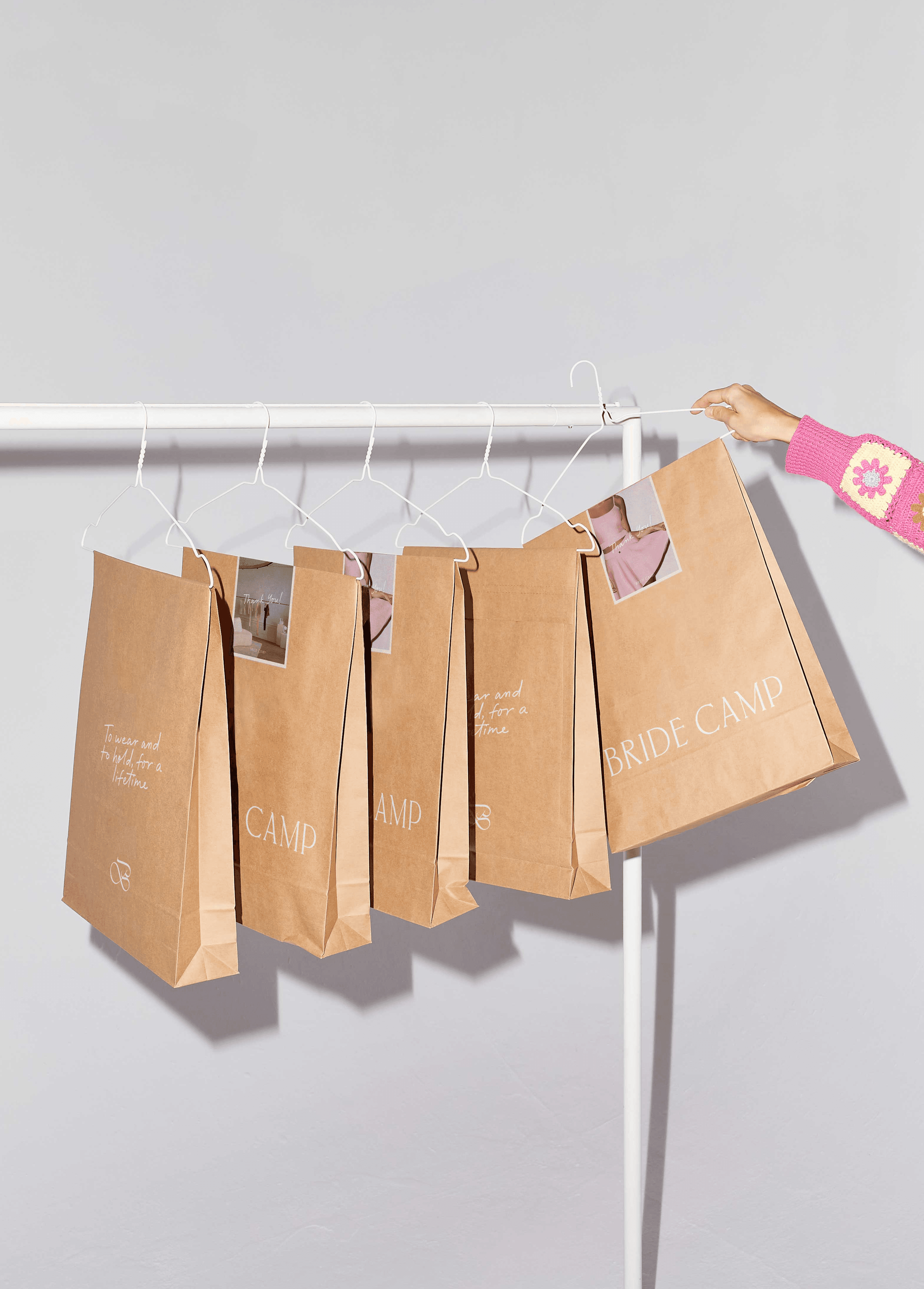
Heartcore came to us at a point where their brand no longer reflected who they had become. They wanted to keep the playful, feminine spirit that made them feel approachable, but they also needed a more polished and results-driven presence that showed the strength behind their workouts.
We started by building a visual language that matched the rhythm of their classes. The energetic orange brings intensity and motivation, while the lavender introduces the calm and balance you feel when the work is done. This contrast gave their identity a new sense of dimension.
For typography, we paired wide, bold fonts with elegant serifs and expressive italics to create a sense of movement, confidence, and a touch of luxury. On the web, we rebuilt their UX around simplicity and discovery. Class browsing became more intuitive, sorting by goals became clearer, and the editorial layout elevated the entire experience. Every decision was made to help users feel supported and inspired as they moved through the brand.
The rebrand and web lift created an experience that better reflected the heart of Heartcore: warm, human, and focused on real results.